
What began as InfluxDB will become InfluxData; going from product to platform. InfluxDB will become one of four products known collectively as the "TICK Stack". This transition of the company is the inception our efforts.
Our goals:
We want the logo to feel like a platform while maintaining its own unique identity. We wanted the company to feel like a larger player, armed with something cutting edge. We want the world to know we're dedicated to making time series data effortless.
Research
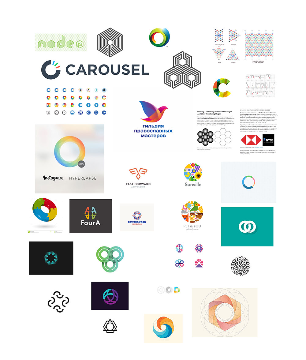
Before starting the design process we wanted to become intimiately informed with the logo and branding efforts of our competition. Since our products are rather cutting edge, there are not many direct competitors. This presents us a rare opportunity to help define the visual culture of time series data. We collected and analyzed numerous PaaS, cloud, and software suite logos:
 Logos of PaaS companies, and a few others
We broke down the set of logos by different design elements. From this we isolated the "most common" way to represent a PaaS company, see our findings:
| Colors | Forms | Typography | Presentation |
|---|---|---|---|
| 13 - Red | 15 - No Symbol | 14 - Lowercase | 24 - White |
| 11 - Blue | 6 - Hexagons | 9 - Capital | 14 - Inverse |
| 6 - Multi | 5 - Clouds | 8 - All Caps | |
| 4 - Green | |||
| 3 - Other |
We concluded that the median logo would be red (or possibly blue), typography driven, and all lowercase. We were convinced that blue would be the dominant color and were surprised to see red. Red feels much more energetic and industrial than blue, which indicates the competition cares a lot about security and stability. We speculate the lack of symbols is probably because many of the brands we looked at are not consumer facing. We feel that lowercase is popular because it gives the logo a quieter, more unassuming presence. It also makes the company feel more approachable.
Of the logos that had a symbol, hexagons were the dominant shape. Clouds as representations of "the cloud" were a close second. Hexagons seem like the go-to representation for data because of their clustering geometry. While both of these shapes are adequate as representations of their concepts, they are sadly literal. We knew we wanted to create something that defied the hexagon trend everyone else seemed to be using. We believe this will help the brand feel more "cutting edge".
We decided on a set of visual concepts we wanted our logo to utilize:
- In motion, not static
- Simple
- A whole made of atomic elements
- Building blocks
- Dimensionality
Next we decided to look beyond the PaaS space. We collected logos and graphics that matched our style goals. We discussed our findings and concluded that interlocking & repeated pieces and using a full color spectrum were the main styles we liked. We wanted these styles to influence our direction but not dictate it.
Exploration
We began by trying to modify the existing InfluxDB logo. With a little adjusting, perhaps it might be able to work as our new logo. The existing logo is comprised of the flux capacitor symbol rotated evenly 5 times. Our first step was to try the same logo but with 6 parts instead of 5. From there we explored other related ideas:

We really liked having 6 elements in the logo; using triangles and hexagons felt strong. Some of these ideas had potential, but we wanted somthing with more weight to it. We tried some ideas that made use of 3 "parts" as well.
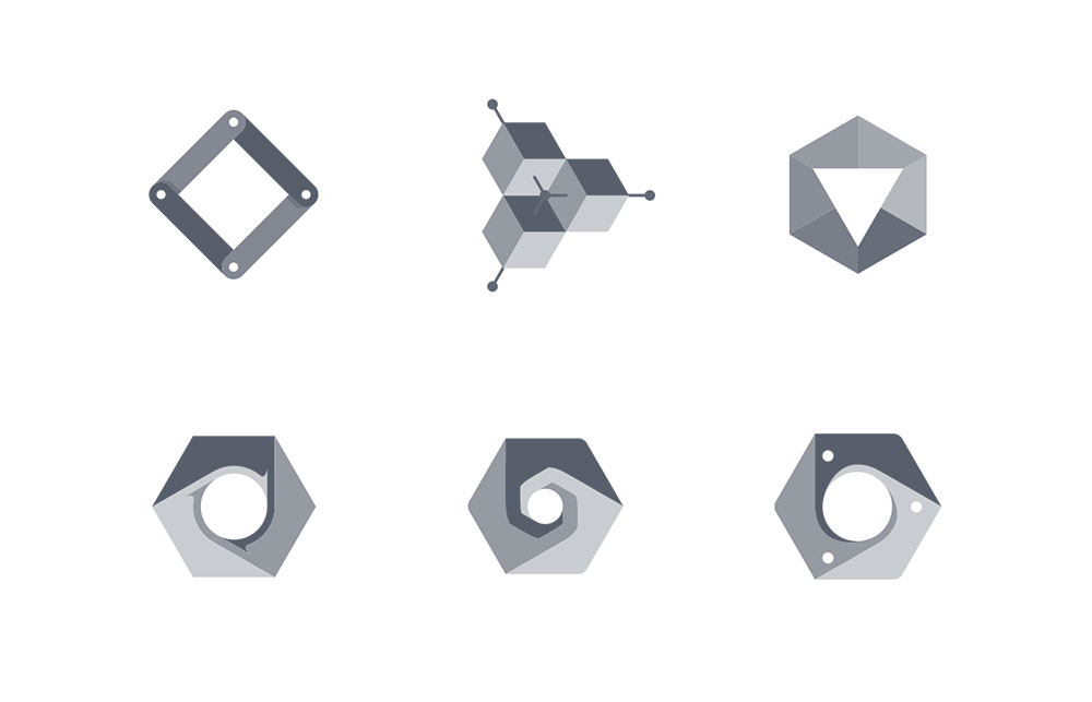
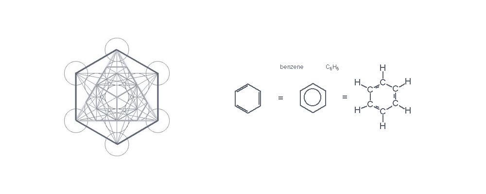
Many designs later a pattern emerged: our silhouettes were almost entirely regular shapes. Even though we wanted to escape the hexagon trend, most of our ideas ended up being hexagons. Circles, triangles, and squares felt too basic and generic so we ruled those ideas out. Hexagons have different kinds of symmetry, and its silhouette affords us three dimensional shapes such as a cube.
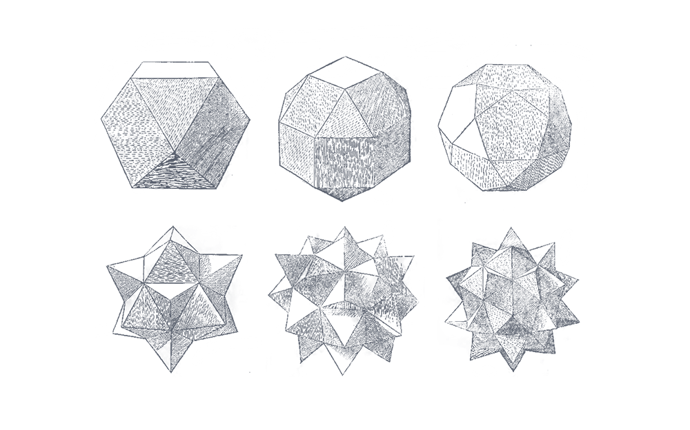
We knew the hexagons felt right, but we had to do something entirely new as to not blend in. Taking a break from designing, we began searching for objects with hexagonal silhouettes. We wanted to consider any and all angles to maximize our potential.
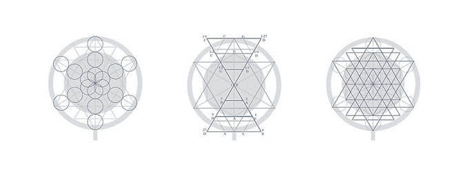
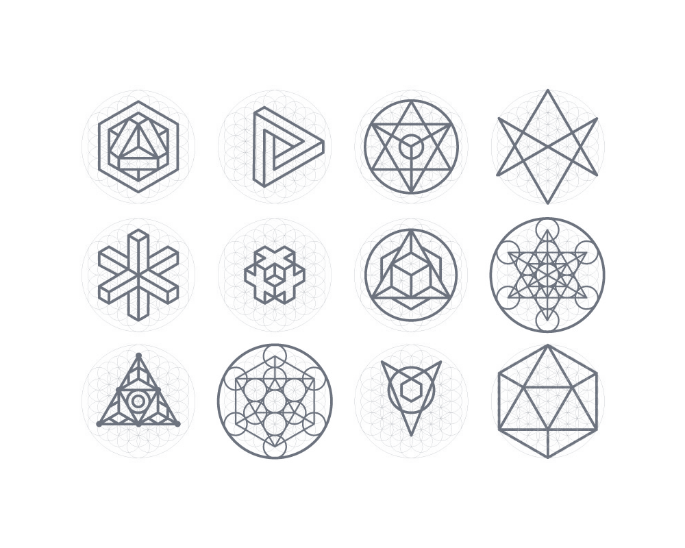 Sacred geometry
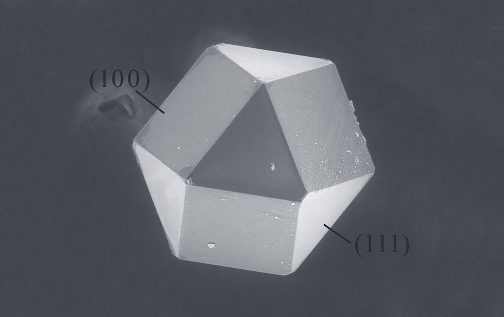 A cuboctahedron shaped diamond, 300μm across
Amidst our research we stumbled upon something very interesting: a synthetic diamond crystal. Look at the sense of power in the shape, the solidarity and simplicity of structure. This naturally ocurring polyhedra is a cuboctohedron.
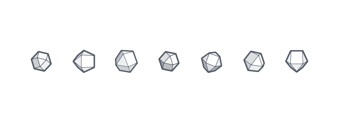
The Cuboctahedron
If you were to transform a hexagon into three-dimensional space, it becomes a cuboctohedron. A cuboctohedron is made of squares and triangles equally distanced apart and most intriguing is that the length of all its vertices are equidistant to it’s center. Buckminster Fuller (Architect and creator of the geodesic dome), says it’s in a vector equilibrium, “the dynamic balance of tensional cosmic forces… can strikingly be developed around one nuclear sphere.” It is the only three-dimensional shape in a vector equalibrium, making it of artistic and spiritual significance to cultures around the world.
In History
The first recorded appearance of the cuboctahedron was in the 13 “Archimedean Solids” which identified "pure forms" of polyhedra. Long after, in 1497 it was illustrated by Leonardo Da Vinci in the book De Divina Proportione where they discuss applications of geometry and the golden ratio. It made many appearances in 11th-13th century Japan as a symbol of divinity. Dr. Derald Langham uses the shape in his “circle gardening” technique calling it the unique shape that contains the "five platonic solids that are the building blocks for all organic life.” In Nassim Haramein’s unified field theory, as he suggests that because of its vector equilibrium, the structure of space-time itself is cuboctahedral. In Star Trek, it made its appearance when some of its characters were turned into cuboctahedrons. Whatever the case, the shape has been linked to many meanings that position it as the crux of cosmic forces and time.
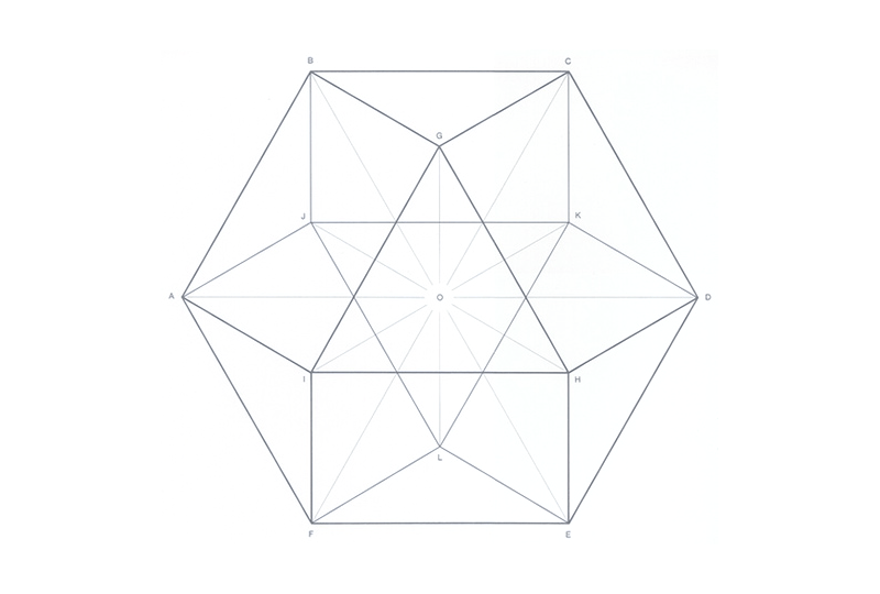
 Leonardo da Vinci in Divina Proportione
Its Meaning to Us
The three-dimensional hexagon to us is a hexagon on steroids, we get the balance and strength conveyed by a hexagon but also the benefit of making it stand-out because it’s three dimensional and has a lot of powerful cultural meanings. We could easily bring the icon into 3D space which speaks to our future potential of being IoT. In this way it really speaks to the IoT world. Going back to our list of requirements, we feel it hits all the points pretty well.
- In motion, not static
- Simple
- A whole made of atomic elements is an atomic element
- Building blocks
- Dimensionality
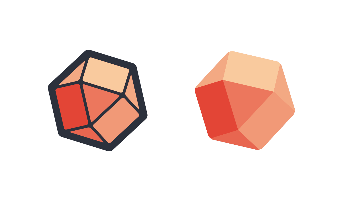
Here’s our first version. Note the slight tilt, gives it some semblance of motion and playfulness. We varied the line widths to make the design feel more dynamic.

Since the cuboctahedron is a three dimensional shape, we wanted to see if we could render it at other rotations.
We quickly found two main directions we could take: outline or no outline:
While seemingly a simple detail, this decision had big implications for how the logo could and would be used. Having more colors is generally less flexible, and exhibits lack of curation. The outline looks great in one color but the thin lines start to disappear at small sizes. There was no clear winner, but we decided to move forward with the outline free option for the sake of exploration. Unsure about color, we tried all of them.
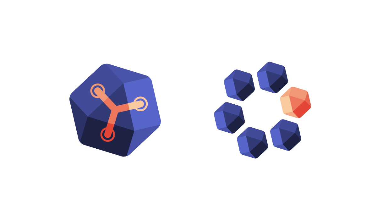
We experimented with clusters of cuboctahedrons, and tried incorporating the Flux Capacitor symbol from the original logo.
Next we started placing our designs alongside the typographic component of the logo. Sometimes it can be hard to imagine a logo as yours when your company name isn't next to it.
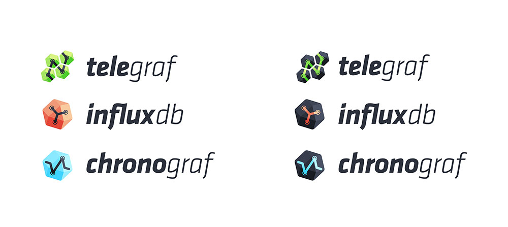
The other facet to this challenge is the TICK stack. Although it currently isn't ready yet, we knew the InfluxData logo would have to play nice with the TICK stack. We already finished some rough designs for Chronograf logos, and had ideas for the others. We decided to start checking our designs against the stack for consistency. If we could design 4-5 logos at once that all felt related and cohesive we'd be killing many birds with a single stone.
Hundreds of designs later, we were feeling a little lost and exhausted. After staring at something so long we weren't sure what looked right or wrong, so we took a break to refresh. Upon returning we reviewed our designs and narrow longformed it down to a handful of our best designs. Our goal was to pick one from this set:
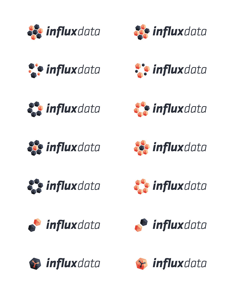
We presented these ideas and there was no clear winner. Interestingly enough we revisited the decision between outlines and no outlines, becuase we felt the outline version felt more hand made. Even though we moved way beyond that logo, it still lingered in our minds. We decided to move forward with the first cuboctahedron we created, and to base the TICK stack logos on it.
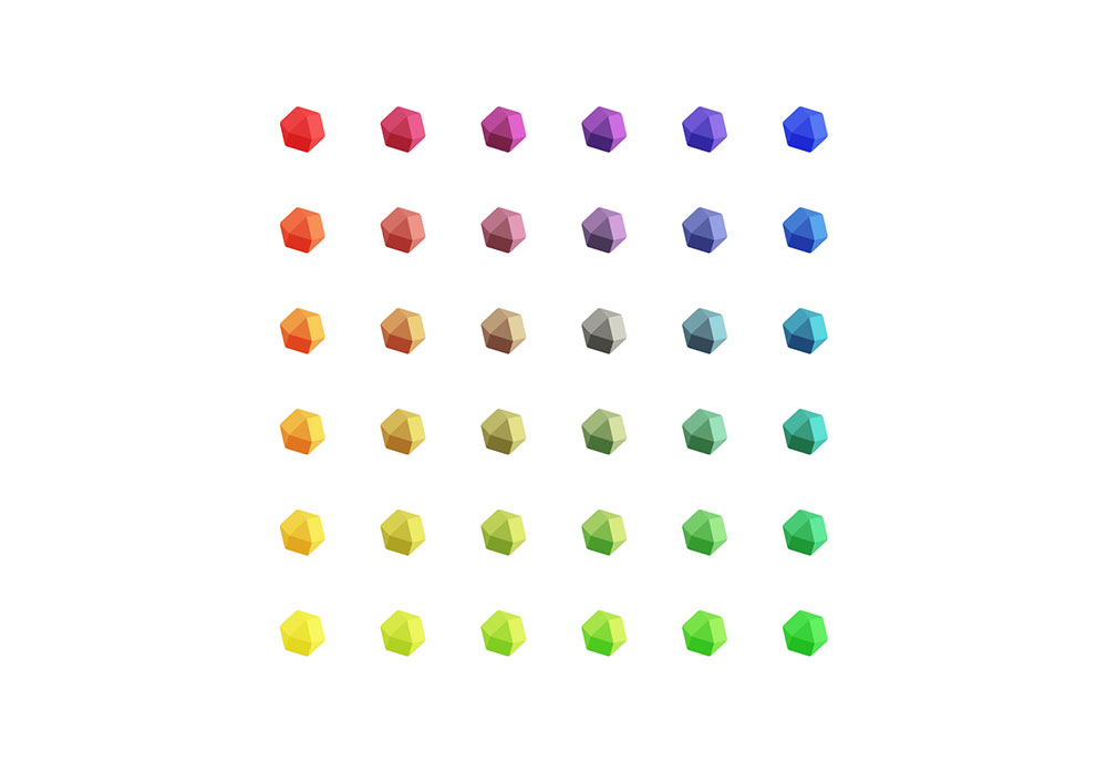
However, despite our efforts we felt it was too ambitious to design logos for each product in the stack simultaneously. We took a step back and had an epiphany: perhaps the stack didn't need individual logos. Since one of our goals with the rebrand was to make it very clear we are a platform, we didn't need each of our products fighting for customer headspace. We loved the original cuboctahedron so much we proposed this idea: what if every product uses the cuboctahedron, but have their own color?
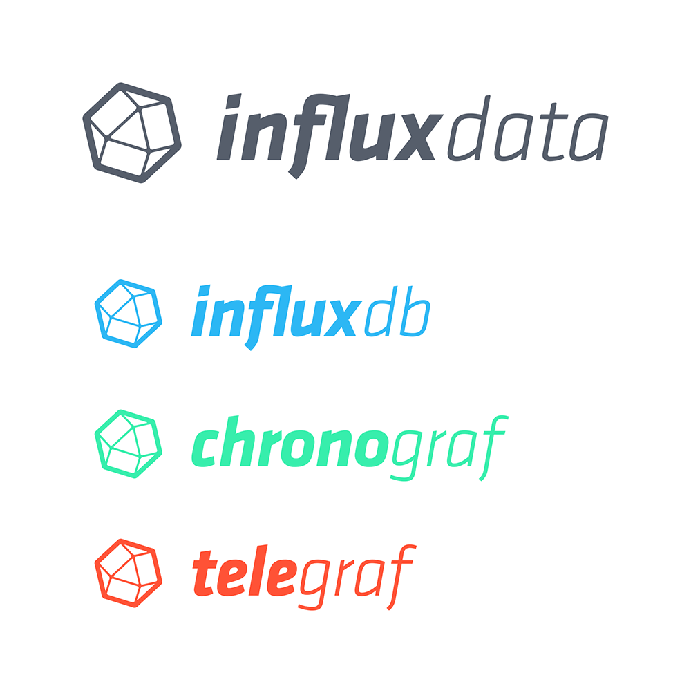
Though we weren't 100% on the colors yet, the color coding approach immediately felt right. Everyone using any of our products would be exposed to the InfluxData brand via each product's logo. Also, if we ever want to add more products we have a lot of colors to choose from and no additional logos to design. We feel this decision will help keep us nimble as a brand.
We debated choosing a brand color for InfluxData that was distinct from the others. Most companies have a primary brand color that they own. For example, Coca-cola has a trademarked blend of pigments that produces a red only they use. The same is likely true for other brands. Alternatively, there are brands that eschew color successfully. It's evidence that successful branding relies on more than visual cues. We knew we liked the logo because of its symbolism and simplicty, so why not keep it that way? And thus, InfluxData was born as a colorless brand. Our main color is technically white, as it is the sum of all colors (our products). Behold our final design:
It’s important to explore all the options before arriving at a decision, and ultimately we came back to the original because it just stuck. We also realized that it would be better to work with one logo instead of multiple. Just like an all-star team shouting for attention vs a well-balanced team that works together, having multiple logos could create noise. Instead we decided to focus on the same symbol and create variation through color. We felt this served two goals, first allowing us to focus on imprinting one logo, and second creates this stronger notion of platform as everything is under the same logo but a different color.
— Alex & Ash
Influx Design Team
Rebrand 2022
In 2022, we refreshed the entire InfluxData brand. The rebrand included new logos, font and colors.
InfluxData Favicons
